I've been given the opportunity to rethink Fitbit's UI language across all devices (smart-watches and trackers). My goal was to update the UI's look & feel, using an iconic language, that will not only be a refresh of style, but will behave as sophisticated UI mechanism on various products.
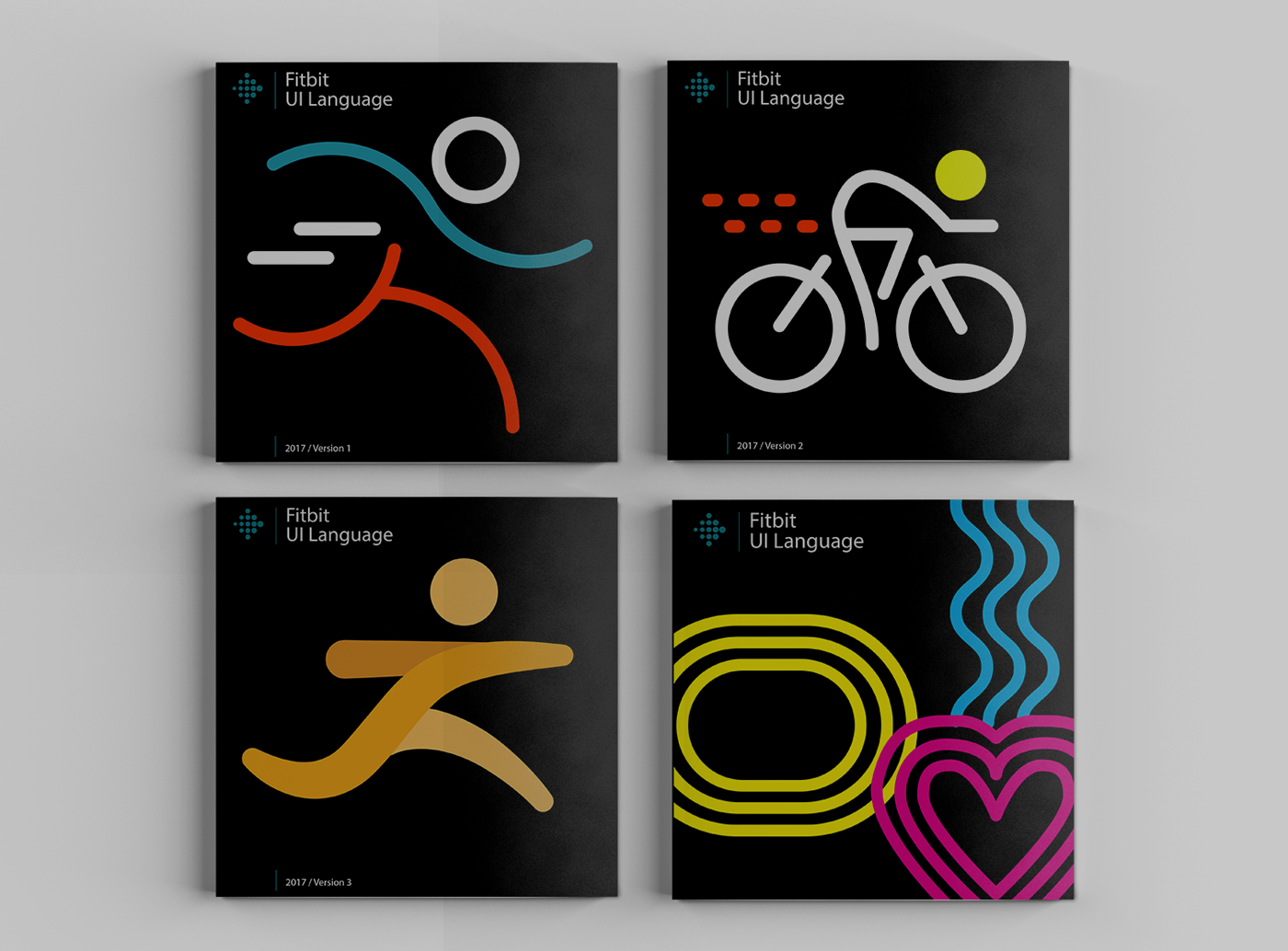
I've started with four different style language variations using Fitbit's activity icons as the starting point. The end result of this explorations phase, were 4 printed brochures. I've found that having brand books was a refreshing and easy way to share concepts with stake-holders

Each concepts consisted ideas around iconography, typography, illustrations and infographics
After the first phase, I've decided to continue further explorations with the most abstract and modern version since it felt like the most interesting style to develop a UI language
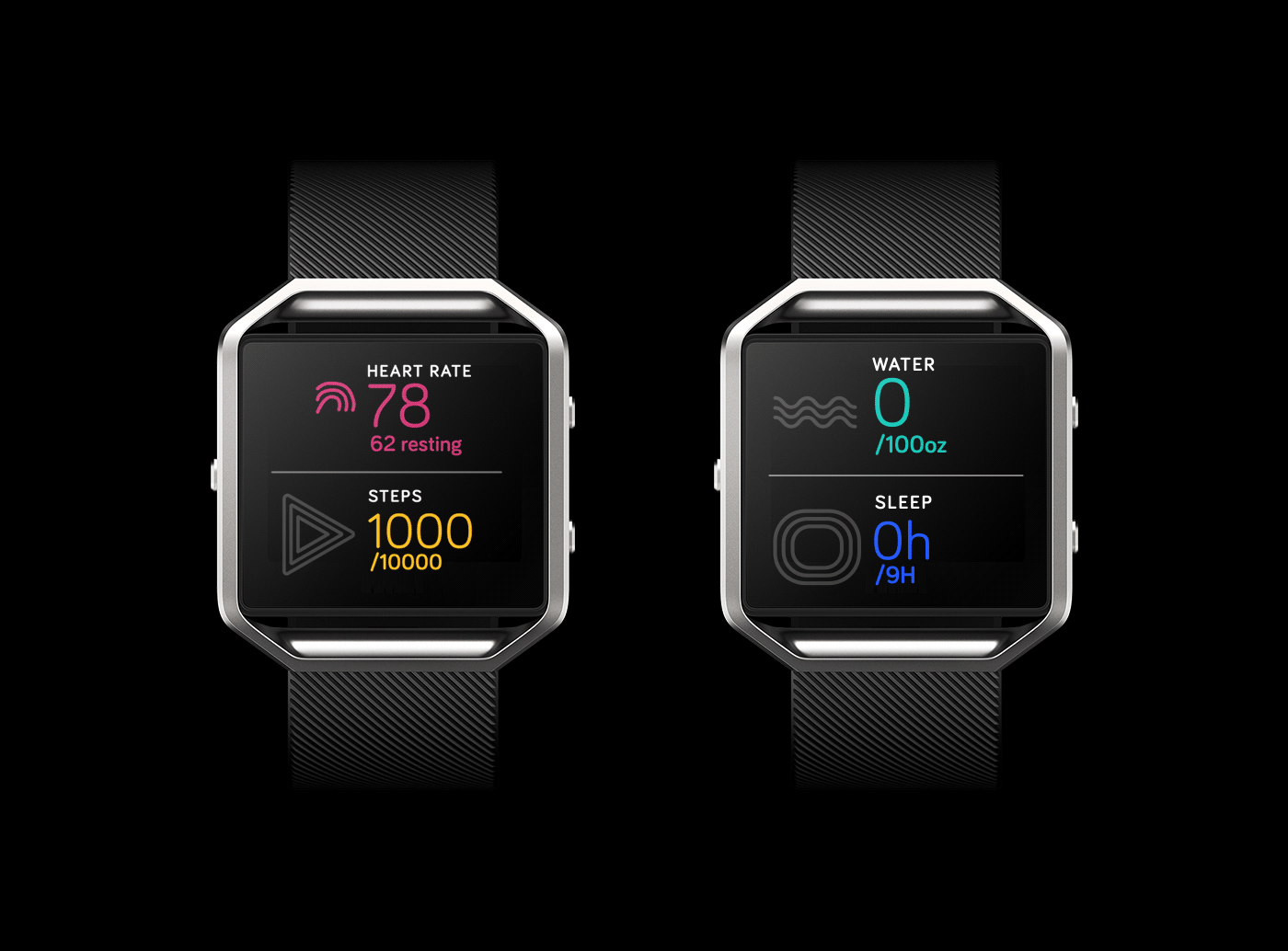
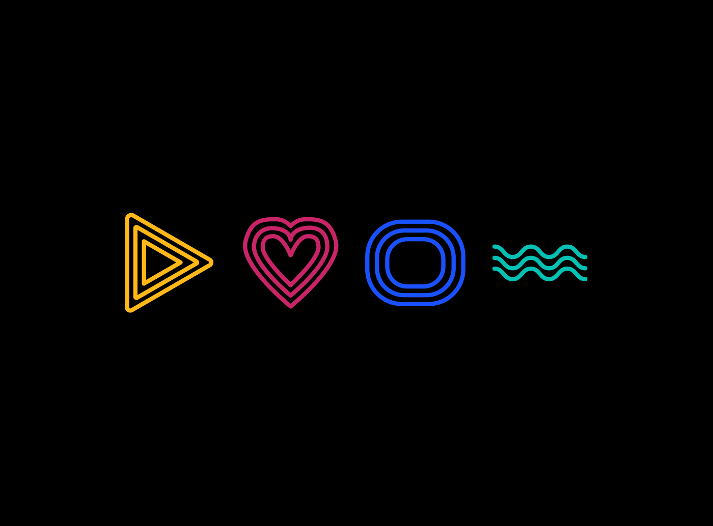
These icons can also serve as a functional infographic UI that can deliver data to the user quickly and efficiently
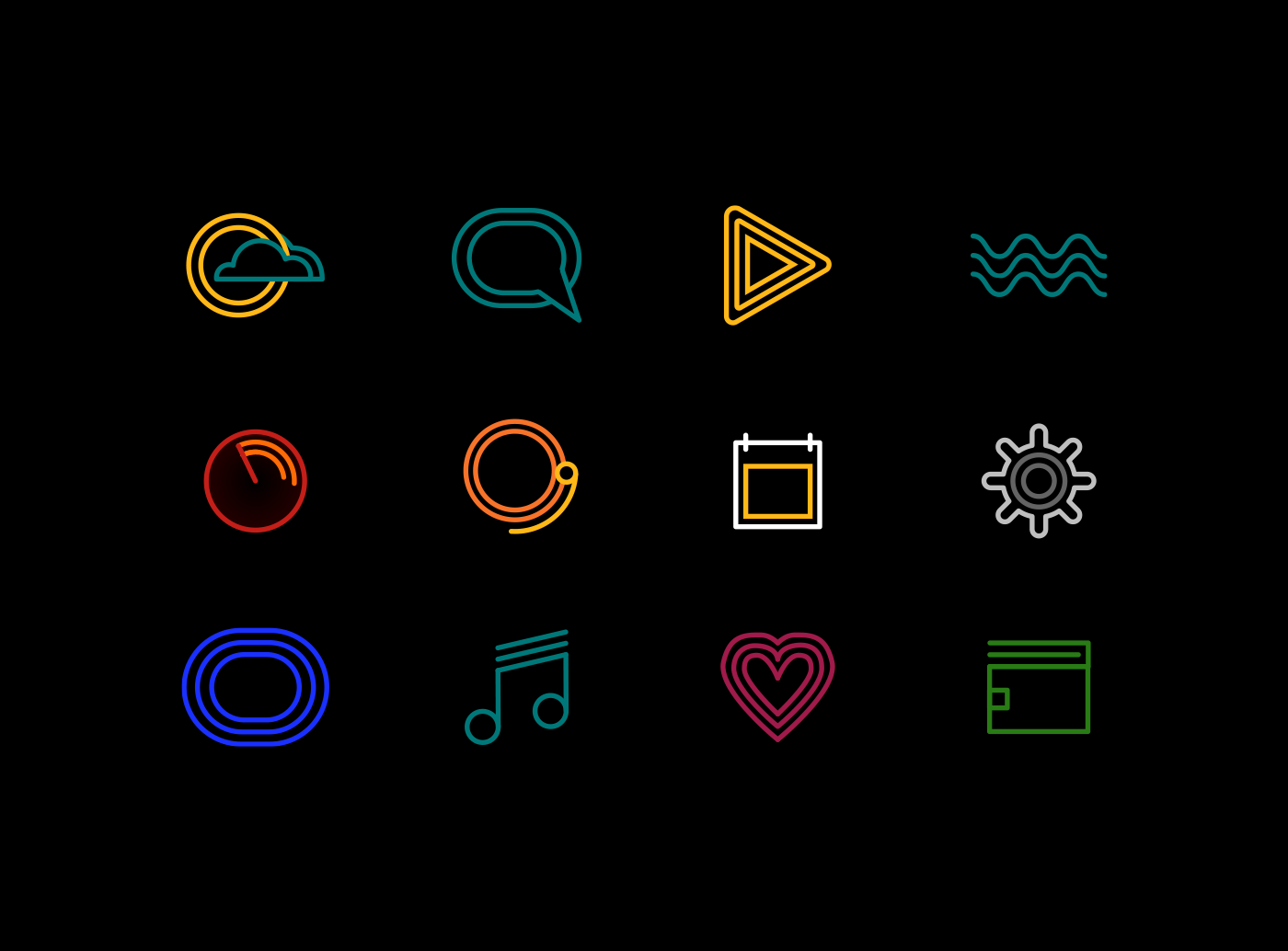
An expanded visual language using the same attributes as the DNA icons
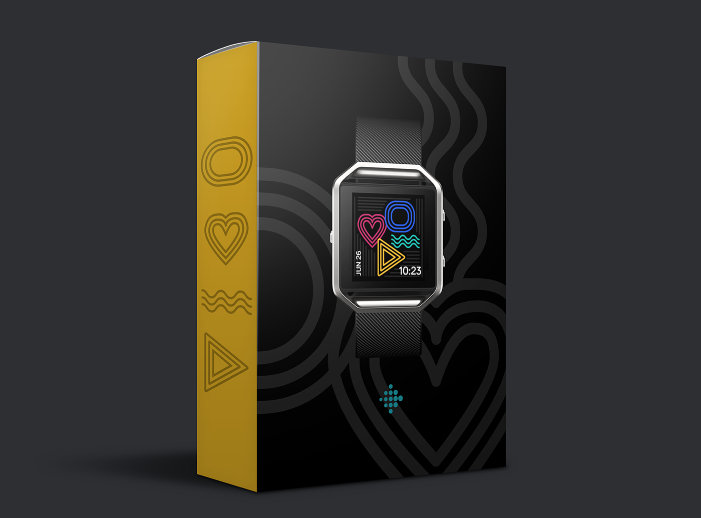
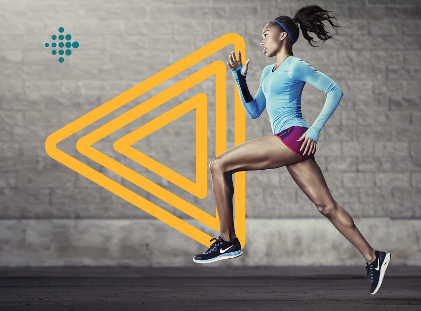
An example of the visual language can be used to elevate Fitbit's brand on retail boxes